
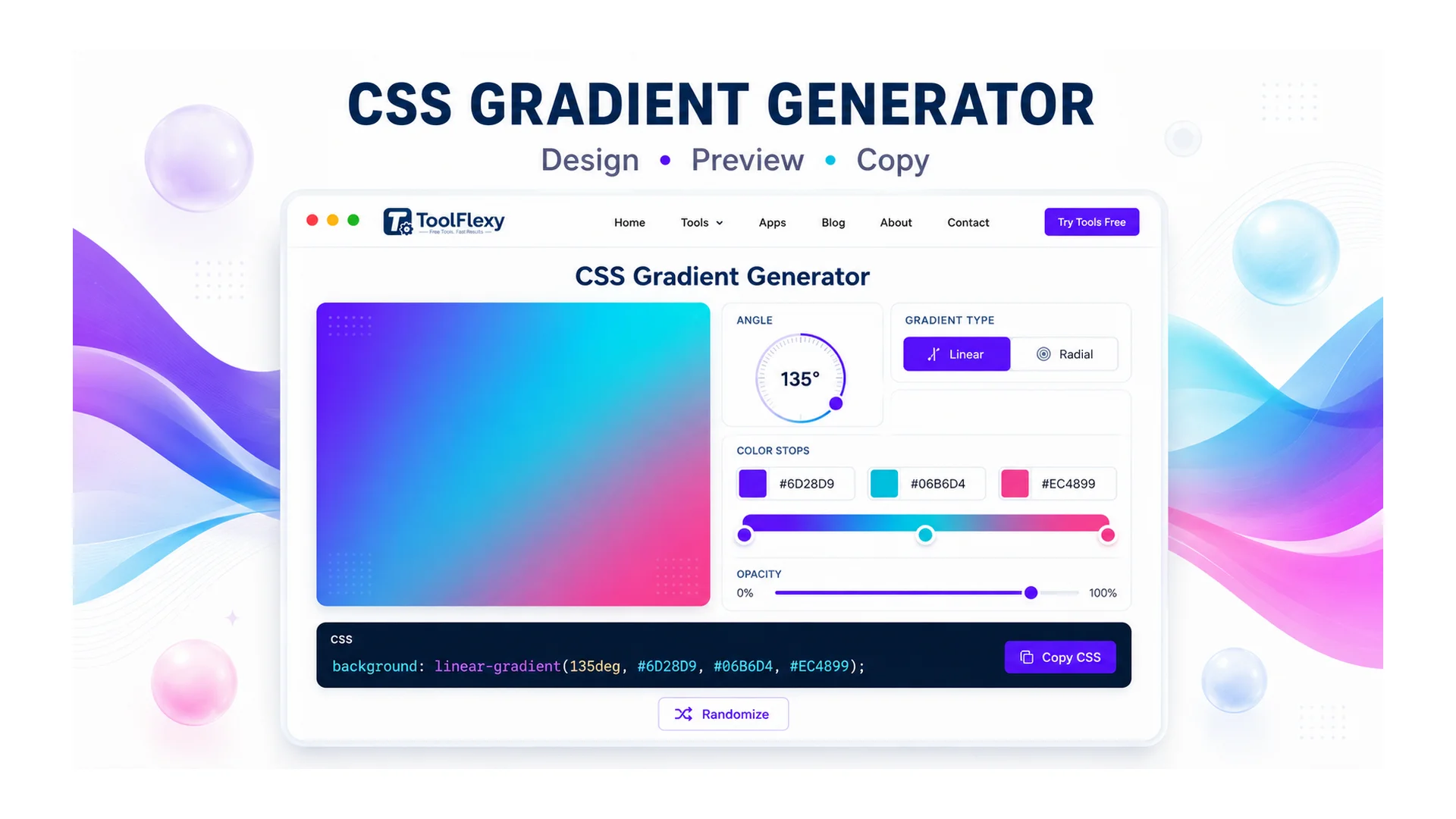
Hand-writing a smooth CSS gradient means guessing at color stop percentages and angle values until it looks right — and getting it slightly wrong usually means a visible hard edge or a lopsided blend instead of the smooth transition you wanted. ToolFlexy’s free CSS Gradient Generator builds linear, radial, and conic gradients visually, with angle presets and a custom-degree input, unlimited color stops, and an endless gallery of gradient presets, then hands you clean CSS to copy straight into your stylesheet.
The 3 CSS Gradient Types, and What Actually Makes Them Different
linear-gradient(), radial-gradient(), and conic-gradient() aren’t just three visual styles — they interpolate color along genuinely different paths, which is why swapping one for another in existing CSS rarely looks like a simple substitution.
- Linear gradients transition along a straight line at a set angle — the direction you pick (0°, 45°, 90°, and so on) determines which way that line runs across the element.
- Radial gradients transition outward from a center point in a circle or ellipse, using sizing keywords like
closest-side,closest-corner,farthest-side, or the defaultfarthest-cornerto control how far the gradient extends. - Conic gradients sweep color around a center point like a clock hand rather than radiating outward — the only gradient type genuinely suited to pie-chart segments, color wheels, and circular progress indicators.
Build any of the three in the CSS Gradient Generator with the angle presets, a custom-degree input, and live preview, then copy the generated CSS with one click — no need to hand-tune percentages until it looks right.
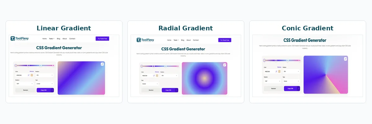
Linear, radial, and conic gradients built with ToolFlexy’s CSS Gradient Generator
A Real Technical Difference: Conic Gradients Don’t Accept Pixel Positions
One CSS gradient detail that trips up even experienced developers: linear-gradient() and radial-gradient() accept color stop positions in percentages or length units like pixels and ems, but conic-gradient() only accepts percentages or degrees — a pixel value in a conic gradient’s stop list is simply invalid. This matters if you’re copying a stop pattern from a linear gradient into a conic one expecting it to just work; per MDN’s conic-gradient() reference, the two functions don’t share the same positioning rules despite looking similar in syntax.
Why Two Gradients With the Same Colors Can Look Different
A gradient defined with percentage-based stops scales proportionally with the element’s size, while one defined with fixed pixel stops does not — so the identical CSS can look smooth on a small button and visibly banded or oddly proportioned once applied to a full-width hero banner. This is also where visible banding shows up most often: large, smooth gradients spread across a big surface can show faint stepping between color stops, especially with only two or three stops defined. Adding a few extra intermediate stops, or nudging the color values slightly, generally removes the visible steps without changing the gradient’s overall look.
Color Hints: The Underused Way to Shift Where a Blend Happens
By default, CSS blends evenly toward the midpoint between two adjacent color stops — but a color hint (a bare position value with no color attached, placed between two stops) shifts that midpoint earlier or later without adding a third color. This is a genuinely useful technique for pulling a blend closer to one side when the default 50/50 transition doesn’t match what a design actually calls for, and it’s one of the CSS gradient spec’s less-known features since it doesn’t show up in most basic gradient tutorials.
Which Gradient Type Fits Which Use Case
| You’re building… | Use this type |
|---|---|
| A background for a hero section or button | Linear gradient |
| A spotlight or glow effect centered on an element | Radial gradient |
| A pie chart, color wheel, or circular progress indicator | Conic gradient |
| A subtle multi-tone background without a clear direction | Radial gradient with a large farthest-corner spread |
Building a Gradient by Hand vs. Using a CSS Gradient Generator
Writing gradient CSS from scratch means typing color values, guessing at stop percentages, and refreshing the browser repeatedly to check whether the blend looks right — a slow trial-and-error loop even for a developer who knows the syntax well. A CSS gradient generator replaces that guesswork with an actual live preview: drag a stop, watch the gradient update instantly, and the corresponding CSS updates alongside it, so there’s no gap between adjusting a value and seeing the real result.
The difference matters most with anything beyond a simple two-color linear gradient. A three- or four-stop gradient with a color hint shifting the blend point, or a conic gradient meant to look like an evenly-divided pie chart, is genuinely difficult to get exactly right by typing percentages and refreshing — small rounding differences between stops are much easier to spot and correct visually than by re-reading a line of CSS values.
A Practical Workflow: From Idea to Copied CSS
Pick a gradient type, then either start from one of the 51 hand-picked presets (or keep clicking “Load More” for an endless supply of freshly generated ones) or build from scratch by adding color stops and dragging them along the preview bar. Adjust the angle using the presets or a custom degree value for linear and conic gradients, fine-tune each stop’s position and color, and the live preview updates instantly so you can see the actual result before committing to it. Once it looks right, the CSS Gradient Generator‘s copy button puts the finished CSS directly on your clipboard — ready to paste into a stylesheet without retyping percentages or color values by hand. If you need the gradient as a standalone image rather than CSS, the tool also exports it as a PNG or WEBP file at preset sizes (banner, social banner, Full HD, square, and story dimensions). Working with someone else on the same design? The Copy URL option puts a link on your clipboard with your exact gradient baked in, so whoever opens it sees the identical colors, angle, and stops already loaded — no re-explaining hex codes over chat.
Explore More Free Design Tools on ToolFlexy
- Color Picker — pull an exact hex or RGB value from an existing image to use as a gradient color stop.
- Image Resizer — resize an exported gradient image to fit a specific platform or layout.
Conclusion
Hand-writing gradient CSS means guessing at angles and stop percentages until the blend looks right, then refreshing the browser to check whether the guess was correct; building it visually removes that guesswork entirely. ToolFlexy’s CSS Gradient Generator handles linear, radial, and conic gradients with a live preview and one-click copy — no sign-up, no limit on how many gradients you build, and clean CSS ready to paste the moment it looks right.